How to Create a Logo for Effective Brand Marketing
Credit: Pexels.com
What makes the difference between good logo design and bad logo design?
Simply put, it’s effectiveness.
Logos are designed to be the face of their brand. If badly designed, poorly aimed, or even just lacking in uniqueness, a logo can seriously impact brand marketing for the worse.
On the other hand, a logo that is well-designed in all aspects becomes a spearhead to branding efforts and gives audiences something visually appealing to attach to.
What goes into creating a logo that will effectively market your brand?
- Type of logo
- Color
- Font
- Graphic style
- Messaging
- Scalability
- Uniqueness
Let’s talk about how each aspect can be used to create a truly effective logo for your brand.
Type of Logo
To get your logo design off on the right foot, consider what type of logo you want to create and try to avoid logo design mistakes like following trends. This is an important step because certain types of logos are more effectively used for specific types of business. Choosing a logo design type that meshes well with your brand gives you the best chance of success right out of the gate.
The basic types of the logo include:
- Wordmark, lettermark, or monogram. These are all font-based logos, using the name of the company or the initial letter or letters as the logo. These are often created using unique fonts, though care should be taken to ensure that the logo is legible. Wordmarks are a great logo style for getting your name out there and ensuring that your audience knows exactly which brand the logo represents. They’re commonly seen in corporations and retail chains. The Coca-Cola Company logo is a good example of this type of logo. If your brand has a long or difficult to pronounce the name, consider using a letter mark or monogram to keep the logo succinct.

Image: Wikimedia Commons
- Mascot logos use a character to create a face for the brand. This character can be a person or an animal — anything with features that can express emotion. Mascots are excellent for creating an emotional bond between the audience and the brand. Mascots are famous within the sports world but are also seen for restaurants — like Wendy’s or Red Robin — and other family-geared businesses.
Image: Business Insider
- A pictorial logo uses an icon or symbol as the center graphic for the logo. Symbols are symbolic of what the brand has to offer; icons are directly representative of services or products that the brand provides. Pictorial symbols are well-loved for the product branding opportunities they provide; graphics tend to lend themselves to aesthetic design better than a simple logotype. Apple, Twitter, Target — these all use pictorial logos.

Image: FreePNGLogos
- Abstract logos are fantastic opportunities to create a unique brand identity that is evocative of spirit and emotion, rather than goods or services. Abstract logos like the ones for Nike are designed to appeal to the personalities of their audience, selling the lifestyle behind the brand rather than simply the product itself.

Image: Wikipedia
- Emblematic logos are usually wordmarks that are placed within an emblem, such as a shield or banner. Emblems are frequently seen in auto manufacturing; they give a noble, distinguished element to a logo such as the Harley Davidson emblem.

Image: Wikipedia
- A combination mark is usually made up of a wordmark or lettermark and a pictorial graphic. These are highly adaptive and are great for new brands and startups that are seeking to build name recognition as well as the effectiveness of graphics-based branding. Either portion of the combination can be used, or both, as needed. Everyone has seen the Microsoft logo which has an effective symbol used in product branding while the full combination mark logo works as a corporate brand identity.

Image: The Verge
As pointed out in the list above, different types of logos lend themselves very well to certain business types. Establishing a family-friendly eatery? Consider a mascot logo. Looking for something more distinguished and professional? Consider an emblem.
Every decision that you make in designing a logo should take the type of business into account, as well as the personality behind the brand. That will become even more apparent as we continue through the elements.
Color
A lot has been written about the use of color in logo design, most of it centered on the psychology of color. Simply put, you can select colors that are more likely to attract your target audience.
Obviously, for brand marketing, color is a valuable tool.
Every designer should spend some time analyzing the audience for the logo they’re putting together and researching color psychology, both for audience demographics and for the market in which the brand operates.
Just as important as that, however, is research into color trends within your market. Trends are often popular for a reason — as a simple example, blue is typically seen as trustworthy, professional, and soothing. So financial institutions such as banks often use blue in their logos; blue is a definite logo trend within the financial sector.
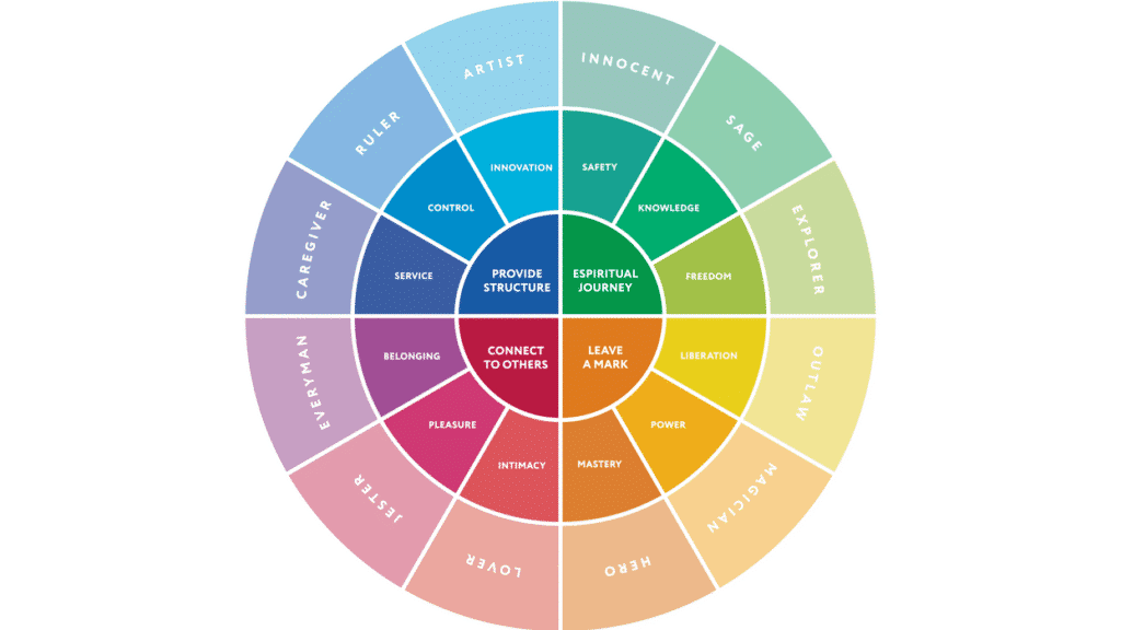
Image: Big Think
However, no trends should be blindly followed. That’s how you end up with copycat logos that don’t stand out from the competition and do nothing to help you market your brand.
Take time to research your market and your competition. Analyze the trends that apply, and make sure to keep colors to a minimum.
Font
Fonts also play a part in how appealing your logo is to your target audience. Many of the same guidelines apply to font choice as to color choice — the psychology of font deserves some research, there are certain trends in different markets, and choosing your font can influence the marketability of your brand.
However, beyond that, it should be noted that font choice is more about the factors of uniqueness and legibility rather than personal preference. Especially if you have chosen to design a wordmark logo, make sure that your font is reader-friendly and that the name of your brand won’t be mistaken for anything else.
Graphic Style
The style of graphics that you choose also says a lot about the brand behind the logo. Imagine the difference in reaction to a brand that uses a cartoon logo versus one that uses a sleek silhouette!
Either of those styles — or any other style, for that matter — are perfectly valid choices, but it’s important to remember that your logo is usually the first time that prospective customers will come into contact with your brand. That all-important first impression will heavily influence whether they seek out your products or services.
Messaging
You’ve probably noticed that we’ve been pointing to the message that your logo is sending with each choice of the design elements. Messaging is a vital point of interest for effective brand marketing and design.
Whether you realize it or not, each and every element in your logo sends a message to the viewer. It’s important to ensure that these elements are in harmony and that the message aligns with your branding.

Image: Pinterest
For instance, if you’re launching a family-oriented brand and your logo is a sleek, simple, black and white logotype, will it effectively send the message that you want?
If you’ve put together a cutting-edge tech startup, and your logo is a cartoon graphic with your name written in Comic Sans, will it effectively represent your brand personality?
Messaging can be tricky, which is why it deserves its own subheading. Ultimately, however, your message is built up of the other design decisions that you’ve made. Your logo is greater than the sum of its parts.
Scalability
For truly effective logo design, scalability and adaptability need to be part of the design process.
To market your brand, your logo will need to be used on a variety of backgrounds, in a variety of sizes. It needs to be able to go wherever you need to send it.
Make sure that your finished logo is in a vector format to guard against loss of clarity as the logo changes sizes. And test it out with various color combinations, including black and white and with only one color, to ensure that it will stand out regardless of the background.
Uniqueness
Uniqueness should really be considered at every stage of the design process. As you go through trends and research the competition, consider how your decision will make your finished product stand out.
The brand itself is unique and brings something different to the table. For truly effective brand marketing, the logo should do the same.
For Logo Design consultation and quotation please check our sample logos here
About Hailey Anne
Embracing the work and travel paradigm wholeheartedly, Hailey likes to write while she’s exploring the world’s destinations. She ghostwrites for her clients at the night and enjoys new cities by day. Connect with her for freelance writing projects.

